Data basis: DAX and FTSE, 2-minute candles built from M1 data, cash session only, 2015 – 2026 (2,933 and 2,927 trading days, roughly 745,000 candles per market). Pattern: 27,425 episodes in the main variant, benchmark 256,111. Exit: trailing stop BE 0.5 / TS 1.0 / step 0.5, flat at the cash close; hold-to-session-end as reference. Net of spread and slippage (cost assumption 2.5 points DAX, 1.5 points FTSE), standard errors clustered by day. Lookahead-free: doji and opposite-colour candle are fixed at that candle's close, the trigger comes afterwards. No trading recommendation.
The observation came from the chart, not from a table. On the FTSE 2-minute chart a doji forms — open and close practically at one level, the market has briefly found a fair price. Then a black candle that sells below the doji's low. And then price breaks above the high of that black candle. The reading is seductive: sellers attempted the downside break, it failed, now they are trapped and have to cover. Long, stop below the pattern. Mirror image for short.
On the observation day it worked twice. Both times cleanly, both times with follow-through. That is exactly why we measured it before it became a rule.
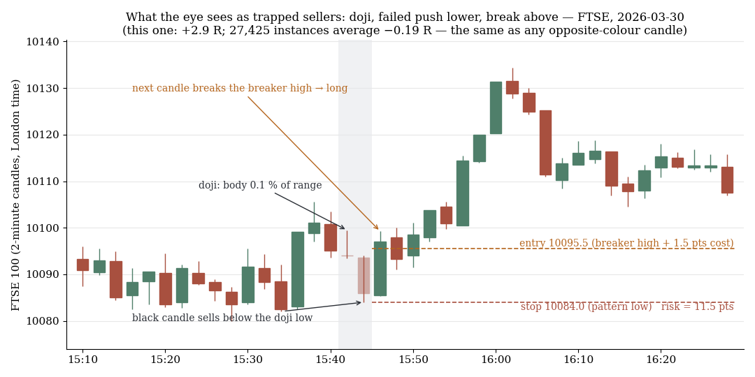
FTSE, 2-minute candles: doji, black candle below the doji low, break above its high, stop at the pattern low. This instance makes +2.9 R; the average of all 27,425 instances is −0.19 R, the same as any opposite-colour candle.
1. The pattern against its own benchmark
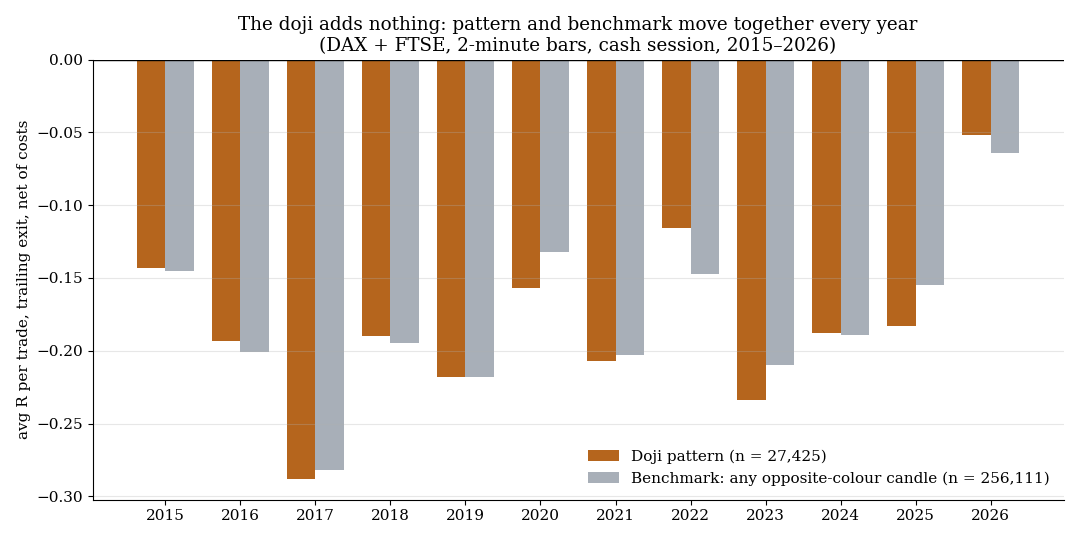
Pattern and benchmark per year: the two series move together for eleven years. The doji adds nothing to the bracket geometry.
The most important part of the test is not the pattern but the comparison line. We ran the same construction — opposite-colour candle, stop order at its extreme, stop at the other end — on every opposite-colour candle of the session, with no doji in front of it. If the doji carries information, the difference between the two rows has to show it.
| Variant (main case: doji body ≤ 10%, trigger within 3 candles) | n | avgR | t (clustered) | Win rate |
|---|---|---|---|---|
| Doji pattern, trailing exit | 27,425 | −0.186 | −31.2 | 26.8% |
| Benchmark without doji, trailing exit | 256,111 | −0.184 | −79.6 | 27.1% |
| Doji pattern, hold to session end | 27,425 | −0.172 | −8.9 | 13.4% |
| Benchmark without doji, hold to session end | 256,111 | −0.176 | −17.7 | 13.5% |
Both pairs of rows are congruent. The pattern loses just under 0.19 R per trade net, and the benchmark, which knows nothing about the doji, loses the same. The profit factor is identical too (0.62 versus 0.62).
Splitting by market and direction changes nothing:
| Market / side | n | avgR | t | Benchmark |
|---|---|---|---|---|
| DAX long | 6,928 | −0.124 | −10.4 | −0.139 (n=130,133) |
| DAX short | 6,834 | −0.155 | −12.9 | −0.139 |
| FTSE long | 6,773 | −0.233 | −19.7 | −0.229 (n=125,978) |
| FTSE short | 6,890 | −0.235 | −20.4 | −0.229 |
Placing the stop at the doji extreme instead of the extreme of the opposite-colour candle makes it markedly worse: −0.596 R (t = −118.6) at a win rate of only 13.0%. After the break of the doji low that stop sits so close to the entry that normal 2-minute noise takes it out.
2. The difference before costs
One could object that costs mask everything and a real advantage of the pattern disappears underneath them. So the same calculation without costs, with a day-clustered standard error on the difference:
| Market, gross (cost = 0), trailing exit | Doji pattern | Benchmark | Difference | t |
|---|---|---|---|---|
| DAX | +0.172 (n=13,762) | +0.170 (n=130,133) | +0.002 | +0.2 |
| FTSE | +0.139 (n=13,663) | +0.150 (n=125,978) | −0.011 | −1.0 |
Gross, there is nothing either. In both markets the difference lies within one standard error of zero. Hold to session end gives the same picture (DAX +0.005, t = +0.1; FTSE +0.008, t = +0.2).
We ran twelve definition variants — doji body up to 10% or up to 20% of the range, with and without the requirement that the opposite-colour candle actually breaks the doji extreme, trigger window of 1, 3 or 5 candles — each with both stop variants and both exits. In no combination does the pattern differ from the benchmark. Split by year, the difference moves between −0.028 and +0.031 R and flips sign repeatedly. By time of day in 60-minute buckets it ranges from −0.027 to +0.053, the outlier coming from the thinnest bucket (n = 767). And the strictness of the doji does not matter: a perfectly flat doji (body 0%, n = 2,460) returns −0.238 R, a body of 10 to 20% (n = 27,353) returns −0.188 R.
Restricted to the window from 2025 onwards, in which the observation arose: FTSE −0.218 R against benchmark −0.213 (difference −0.005, t = −0.2), DAX −0.065 against −0.041 (t = −0.9).
3. Why the pattern cannot live at all
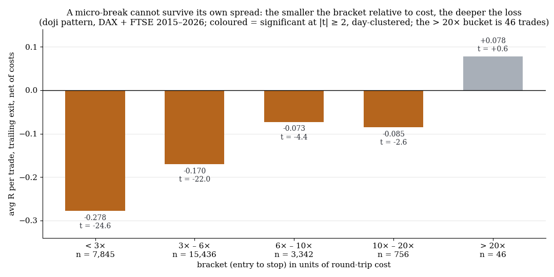
The smaller the bracket relative to cost, the deeper the loss. A 2-minute pattern produces almost only brackets below six times the round-trip cost.
The second question is why both rows sit so deep in the red. The answer lies in the size of the bracket. The median distance between entry and stop is 8.0 points on the DAX and 3.5 points on the FTSE. With a cost assumption of 2.5 and 1.5 points per round trip, the spread eats 31% (DAX) and 43% (FTSE) of the risk before the trade has even begun.
Split by bracket size in cost units:
| Bracket / cost | n | avgR | t |
|---|---|---|---|
| below 3× | 7,845 | −0.278 | −24.6 |
| 3× to 6× | 15,436 | −0.170 | −22.0 |
| 6× to 10× | 3,342 | −0.073 | −4.4 |
| 10× to 20× | 756 | −0.085 | −2.6 |
| above 20× | 46 | +0.078 | +0.6 |
Only from a bracket of roughly six cost units does the result approach the zero line — and those cases are rare. Structurally the pattern is a micro-break, and breaks whose risk is on the order of the spread do not live. That the simulation with "only one position at a time" (about 3.1 trades per day) changes nothing, at DAX −0.129 R and FTSE −0.233 R, is merely confirmation.
4. The simulator finding
The benchmark's gross value of roughly +0.15 to +0.17 R looks at first glance like an edge of the bracket geometry. We therefore pushed a synthetic random walk (30 ticks per minute, 500 minutes per day, 3,000 days) through exactly the same calculation chain, without costs. A stop system on a random walk has to return zero in expectation.
It returns +0.156 R (n = 131,789, t = +59.6) for the benchmark and +0.137 R for the doji pattern.
That means the chain carries an optimistic discretisation bias of roughly +0.15 R at small brackets, because fills are assumed exactly at the level and the bracket is only two to three times the size of the one-minute volatility. The entire gross "advantage" on the real data is a simulation artefact. For this study that is not a problem — the A/B comparison with identical code remains valid — but the absolute figures of any test on sub-5-minute brackets are worthless without such an anchor. Anyone who sees +0.15 R gross may just have measured their simulator.
5. The anecdote that triggered the test
On the observation day, the code ran over the same candles the eye had seen. It finds four patterns in the strict variant. Two of them are exactly the two that had stood out: +1.34 R and +2.04 R with the trailing exit. The other two, also in the early morning, both ended at −1.00 R — and had not been noticed.
That is the recency and survivorship trap in its purest form. The eye registers the patterns that worked, because afterwards came a move one could see. The failed patterns do not look like patterns in hindsight. Two hits on one day become a hypothesis; 27,425 cases across eleven years become a null result.
6. What this means
On the 2-minute chart the doji carries no information about the subsequent move. The story about trapped sellers cannot be distinguished from the geometry of an arbitrary micro-break, and that micro-break is dead after costs.
The more general lesson applies to any candle observation on sub-5-minute charts: first put it against the "every candle" benchmark, then check the cost share of the risk — the benchmark requirement from our methodology study, applied to candle patterns. If the spread makes up more than a third of the bracket, the question about the pattern is already answered. This matches our earlier finding that a "trap" candle on the hourly chart is only a proxy for where price stands a few minutes later — the candle shape itself explains nothing that the close does not already explain.
7. Limits
- In-sample, no out-of-sample split. For a null result across 27,425 cases, all years and all variants that is a weak objection, but it belongs here.
- No external validation anchor. The pattern does not exist in our episode base, so a separate 2-minute chain was built. Absolute values are only readable relative to the benchmark computed alongside; the random-walk anchor shows a bias of roughly +0.15 R.
- Bid data without real volume. Whether volume could filter the pattern was not tested.
- Fixed cost assumption. 2.5 and 1.5 points per round trip are estimates; real spread at the open is higher, which would worsen the result further.
- DAX and FTSE only, cash session only. Three of the four patterns on the observation day occurred before the cash open and thus outside the tested window.
- Not tested: doji definitions using volume or context (day high/low, previous-day levels), timeframes above 2 minutes, discretionary selection among the patterns.
📄 Full study as PDF: 7 pages incl. all tables, figures and limits (in German).
Disclaimer: Historical statistics are no guarantee of future market behaviour. This study is not investment advice. Trading involves risk of loss up to total loss.